Corporate Branding / Identity
I often like to develop logos first in black and white,
I have found that is can expedite the approval and
development process.
Business Papers and logo package for a residential development on the Atlantic coast.
 To the left is an example of the process I go through when working on a logo. I typically try to work off of an emotional theme so to speak. What does the visual language say about the company? Are they agressive, stable, nurturing, or all of the above. I have the firm belief that 99% of the time the client knows exactly what they want the just dont know what it looks like yet. So using tools like word association and talking with them about the business gives you themes and clues to expand upon. Then you just have to draw it, that is part of why I prefer not to get into color until a design has been agreed upon, it muddys the waters so to speak.
 Here is the final design that came from the sketches. The general theme was in putting the needs of the child first; acting almost as their champoin. The client also requested that the full name of the group appear on the logo. As you can see the name is a bit "wordy" so writing it in a conventional style it would have ended up looking like a paragraph and a picture instead of a logo.
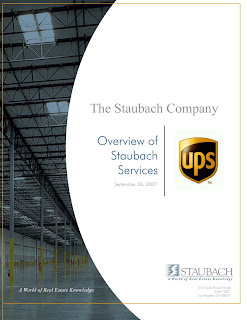
This document was a capabilities and corporate overview piece. It represented a new branding for the Los Angeles office. The overall idea was to maintain corporate identity of the brand but with a more contemporary look.
Staubach represented an unparalleled commitment to standing behind the value of their services. I used a photo of their chairman behind this guarantee to signify that it represented more than an ideal but a personal commitment. One they were willing to "stand behind" and sign their name to.


